Recently, we were asked to speak at the 2024 CauseVox Summit for Personalized Impact about Building An Impactful Website to Inspire Action.
CauseVox is a donation platform helping not-for-profits secure more donors in less time. So it was only fitting that we tailored our presentation to help the attendees secure more funding through clear messaging and streamlined user experiences.
Last week we explored writing winning headlines for your organization — and broke it down into identifying your Golden Circle, finding your Job 1, three (3) steps to creating an impact story for your audience. Today we’re looking at how to apply user experience (UX) practices to the opening screen of your website’s home page.
Psst…we’re even giving away Five (5) FREE Website Audits this week! Read on book your spot!
Read time: 4 mins
What is UX?
UX, or User Experience Design in a nutshell is how a user interacts with and experiences a product, system or service. UX adheres to universal laws and design principles applied to a digital ecosystem, in this case your website. It includes a person's perceptions of utility, ease of use, and efficiency. As designers, we need to be deeply in tune with our audiences’ emotions, needs and wants and deliver these in a succinct pathway to drive organizational goals and give the user what they’re looking for.
The starting point
Continuing on with last week’s example, we’re redesigning the homepage UX for a not-for-profit organization to (1) improve conversions on donations and (2) volunteer sign-ups and ultimately help this organization fulfill their mission:
To end starvation, starting in
our own backyard.
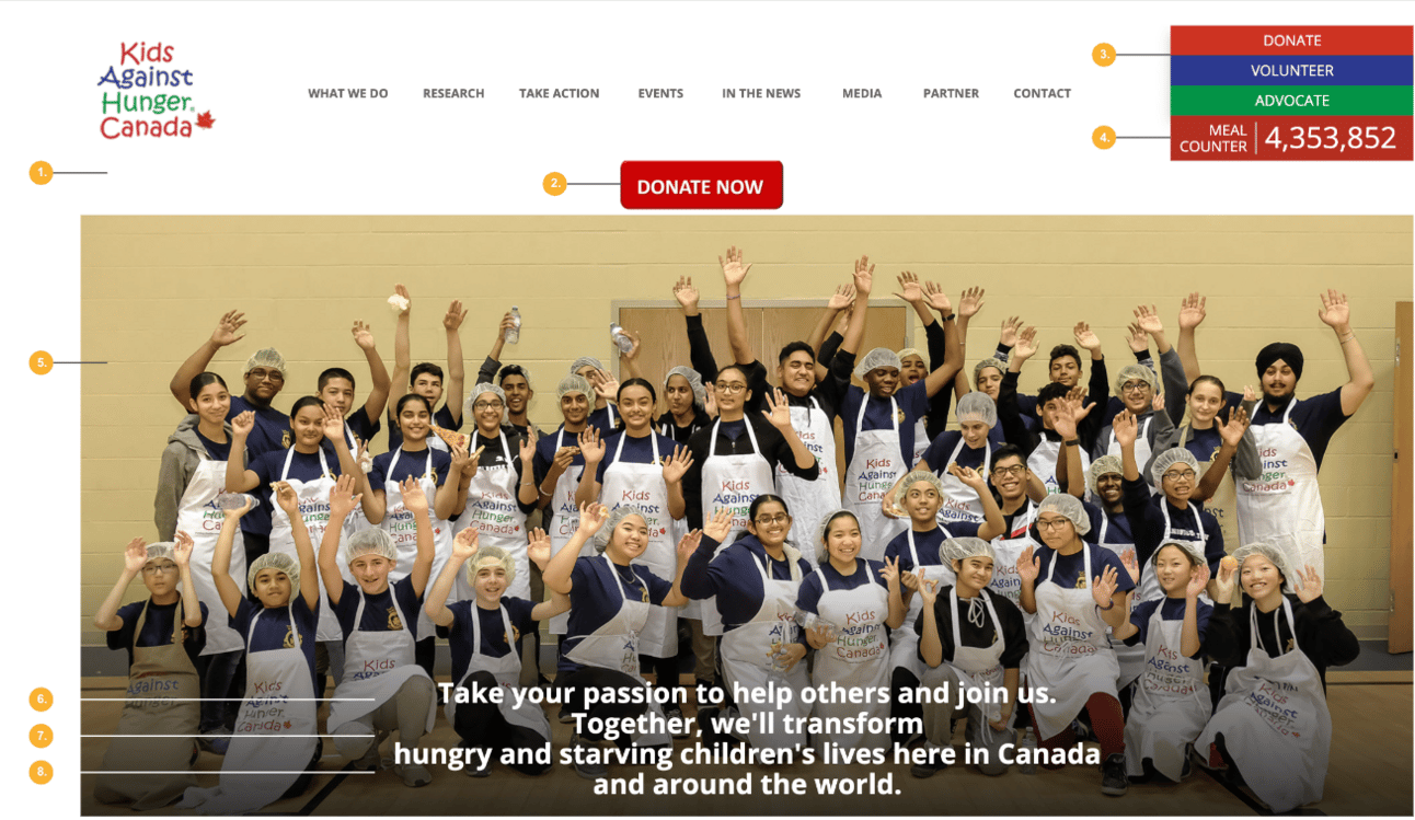
Let’s start with the existing “above-the-fold” hero banner. This is where most traffic will land and it’s our first opportunity to create a pathway to direct visitors.

The navigation is takes up 30% of the real estate.
The “Donate Now” call-to-action is floating in the middle of the navigation,
Secondary calls-to-action are hidden in top right corner — too many CTAs results in a muddy user experience and visitors aren’t clear about their expected next step.
Meal Counter is a good idea to show the impact, but it’s location and colour create confusion; it’s positioned as a CTA.
The image showcases the volunteers BUT this isn’t Job 1. It presents challenges with many faces and makes it difficult to position text over the image without either the image or the text being lost.
No hierarchy between headline and subheading, and line breaks makes this hard to read.
The heading and subheading are aspirational but not emotional or actionable.
The re-design
By addressing these points we know we have two important focuses on Job 1: Secure donations.
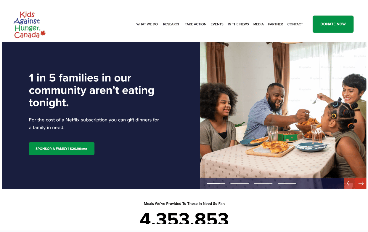
Here’s our suggested re-design to address Job 1:

One message at a time. Introduced a sliding banner to share multiple messages.
Shrink the navigation height. Giving more breathing room to the message.
Simplify calls-to-action. Ever-present “Donate Now” CTA in the top right of the navigation and a more pointed “Sponsor A Family for $20.99/mo” adjacent to the image paired with the headline and subheading.
Meal counter. Moved this further down the page as a focus on the impact the initiative is creating. This keeps the hero banner clean and focused.
Image and copy. Clear distinction between image and headline without losing the message of either element. The image focuses on the result: a family enjoying a meal together and the copy suggests how the visitor can make this happen with limited sacrifice.
Headline and subheading hierarchy. Visual hierarchy between the headline (H1) and subheading (H2) to make the message readable. The H1 explains the problem and the H2 explains the solution.
A-C-E formula: Actionable, clear and emotional headline and subheading paired with a CTA to tell users what to do next.
CTA colour: Created a simplified visual language for the CTA. Green means “Go”!
If you’re website is struggling to inspire action we’re offering A FREE 20-Minute Website Audit this week.
Hurry! Space is limited to 5 spots.
Let’s do some good, shall we?
Subscribe to the newsletter and let's create a
sustainable future together.
